Personal project · 2026
Portfolio 2026.
Designing a clearer first conversation.
A portfolio is the first piece of design a hiring team experiences. This one brings my work, my thinking and the person behind both into a clear, welcoming website.
- Designed for
- Recruiters & design teams
- Scope
- Strategy, content, design & development
- Status
- Live
The brief
Make the work
easy to understand.
The goal was to help a hiring team understand what I do, see how I think and decide whether to start a conversation. Attractive screens alone cannot explain the scope of a designer’s work.
The portfolio needed to support a quick first look and a deeper read. It also had to present ongoing work honestly, respect confidentiality and keep the focus on full-time opportunities in India and internationally.
One clear route through the work.
- 01
Meet the designer
Role, focus and experience.
- 02
Find relevant work
A considered project selection.
- 03
Understand the choices
Context, decisions and detail.
- 04
Start a conversation
Résumé and direct contact.
Design decisions
A few choices.
A clearer whole.
Introduce the person before the projects.
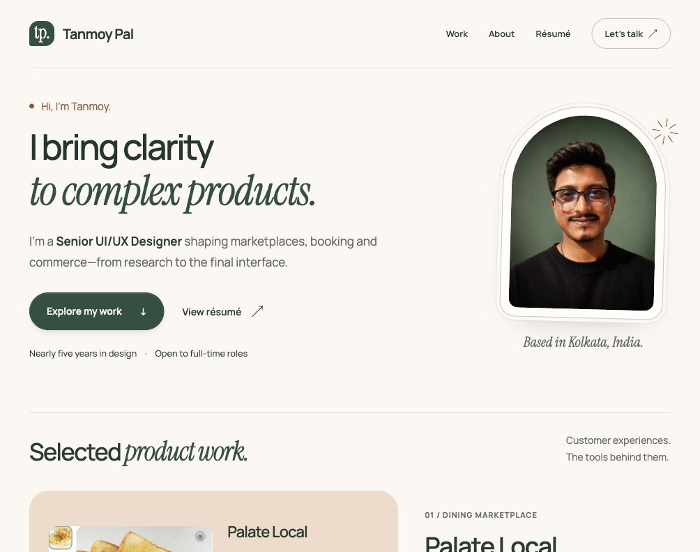
The opening brings my role, experience and focus together with a real portrait. The work follows in its own section, so one client project does not stand in for my whole practice.
See the introductionMake the selection do the work.
A wide lead project establishes depth; two supporting projects show related problems from different angles. Earlier work sits in a separate, expandable section, giving interested readers more to explore without crowding the first view.
Explore selected workGive the page room to breathe.
Feedback on the first version was clear: it felt congested and too ordinary. The design moved toward a warm cream and green palette, more space between sections and a restrained mix of sans-serif and serif type.
See the About sectionLet confidence come from the evidence.
The project pages explain the purpose of visible design choices. Work in development is labelled, proposals are separated from completed work, and unsupported outcome figures are excluded. Clear wording helps the work speak for itself.
Read the earlier projects
Refinement
Confidence in the story.
Care in the finish.
The review first focused on confidence. The introduction became “I bring clarity to complex products,” followed by a specific role and product focus. Earlier-project descriptions began with the problem and the purpose of the design.
The usability review addressed smaller details: keeping contact navigation on the current project page, improving caption contrast and making project links and the earlier-work heading clearer to assistive technology.
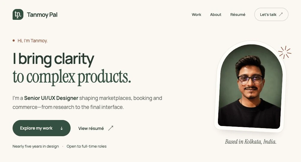
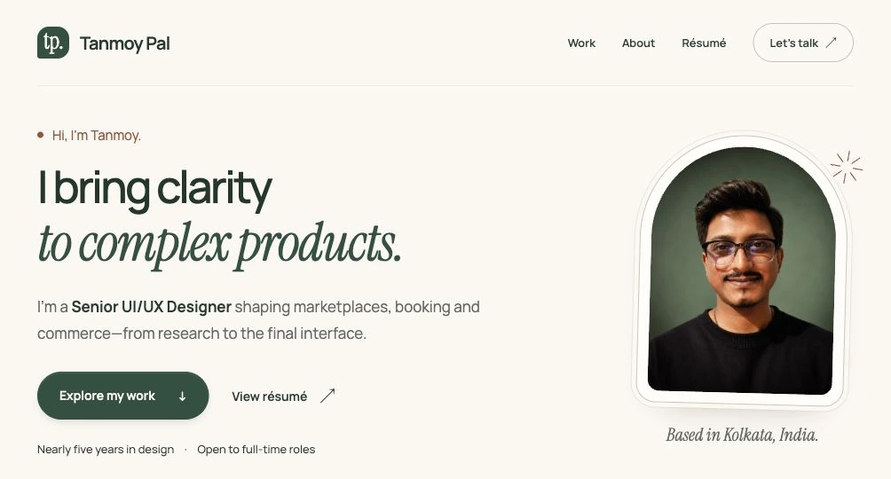
The final visual brief was to make the site feel more distinctive and carefully made while staying professional. The structure, original lowercase “tp.” badge, project presentation and content stayed in place. The refinement focused on how they were presented.
- Typography and space
- A lighter headline and selective italic serif emphasis give the opening more character. Additional breathing room and fine section dividers help separate the introduction from the work.
- Portrait and surfaces
- A finer double border and less tilt make the portrait feel more carefully framed. Subtle shading in About and a deeper green contact panel carry that attention through the page.
- Quiet interaction
- Existing arrows respond with a small movement on hover and keyboard focus. That movement is removed when reduced motion is requested; visible focus outlines remain.
The aim is a more considered first impression. Whether recruiters experience it that way still needs to be tested.
How it was made
Direction, review
and iteration.
I set the brief, supplied the work and career details, chose the project presentation and reviewed the design through each iteration.
The portfolio was developed with AI assistance from ChatGPT and Codex for research synthesis, writing, design exploration, coding and implementation checks.
What was checked
Care in the details.
Small and large screens
Layouts checked at 320, 390, 768 and 1280 pixels. The latest visual pass rechecked the homepage at all four widths for overflow and broken loaded images.
Keyboard navigation
Skip navigation, the earlier-work disclosure and booking-state controls checked without relying on a mouse.
Readable, usable controls
Text contrast reviewed and corrected; accessible link names aligned with their visible labels. The refined text and background combinations were also checked against both ends of the new surface gradients.
Connected pages
Internal links, section links, images and the résumé checked in the production build. All 16 existing site and search checks passed after the visual refinement.
These are implementation checks. Recruiter usability testing and hiring outcomes have not yet been measured.
The next test
Does the story
come through?
The next step is to observe whether recruiters can identify my role, explain one design decision and find the résumé or contact details without help.
Explore the portfolio